- Published on
Create Readable Power Platform Architecture Diagrams with the C4 Model
- Authors

- Name
- Calum Harrison

Software architecture diagrams can be confusing to understand, some are overly complicated, while others are too abstract. So when I discovered the C4 model and learned how to make software architecture diagrams readable, I applied this to the Power Platform and wanted to share this with examples.
This blog isn't covering how to draw diagrams it's to show you the C4 model applied to Power Platform Architectures.
We're engineers not artists
Before learning C4, I focused on creating pretty diagrams rather than showing clear boundaries and business context. You can see how this happens, when you perform a web search for "software architecture diagrams" you will get a mixture of pretty diagrams with colours or diagrams that look too busy.
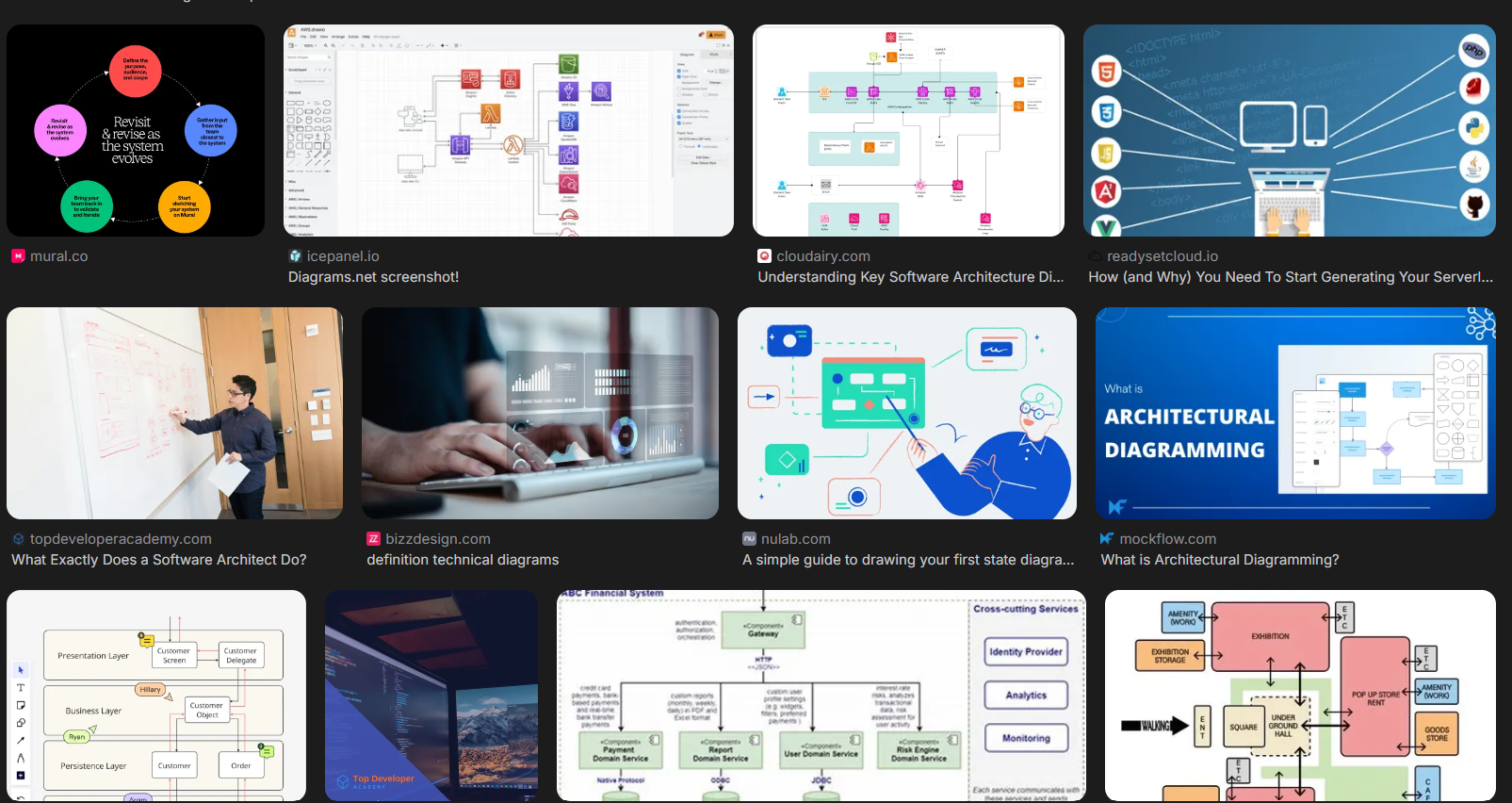
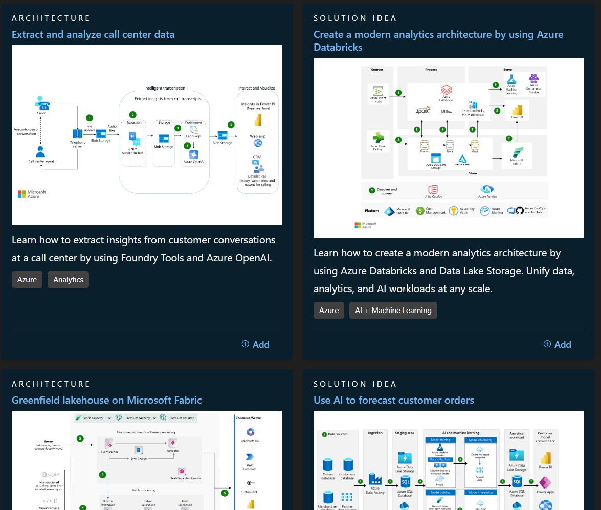
The above is applied to some of the Microsoft's sample reference architecture diagrams too. The use of icons are used heavily but the boundaries and business context isn't as clear.
C4 Model
C4 Model is a framework on how to describe and communicate software architecture by 4 levels.
We won't mention the "Code" level as its generally not recommended to use as it's not a great of return with the time you invest. Plus, this level is more geared towards systems with heaving pro-code Java etc not the Power Platform.
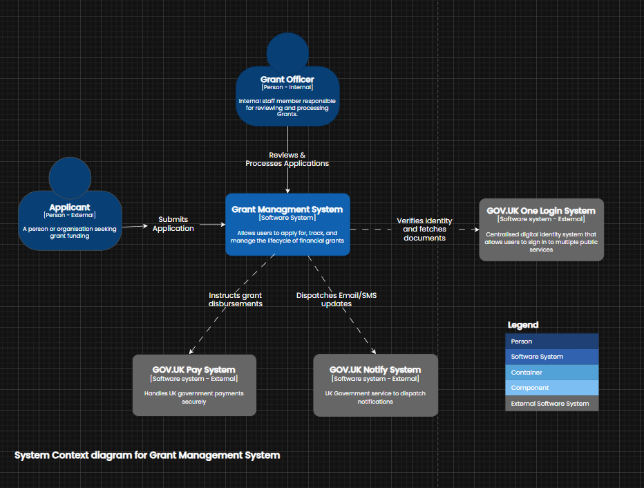
Context
Context within the C4 model shows the highest level view of the system.
In this example, were showing how the personas interact with Contoso's Grant Management System . You will notice the diagram doesn't mention any names of Power Platform products as this diagram should be understood by anyone regardless if they're technical or not.
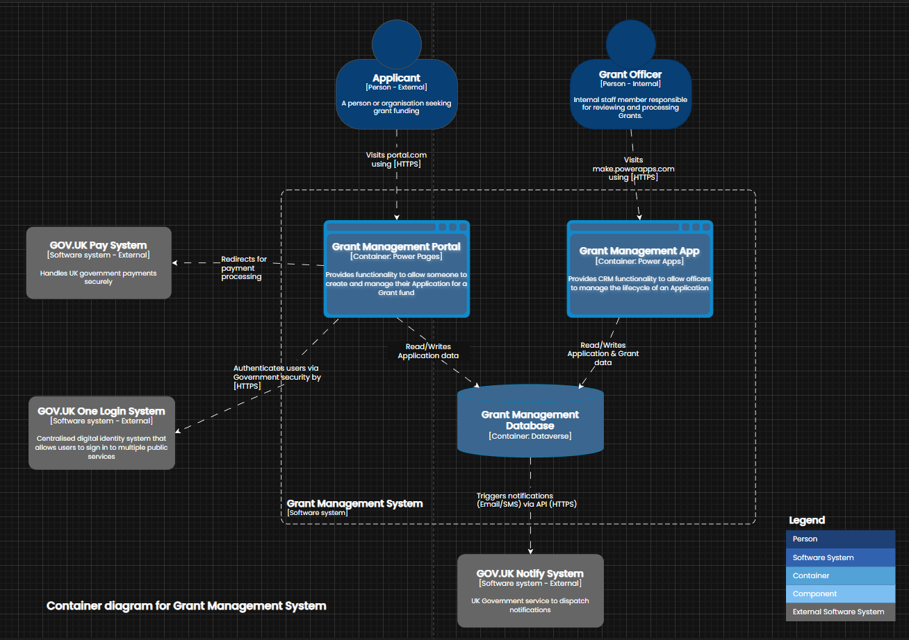
Container
Container (not Docker containers) are used to zoom into boundaries, normally a application or datastore.
In this example, were zooming into Contoso's Grant Management system. Notice no icons are used but we now introduce the Power Platform products within the container view.
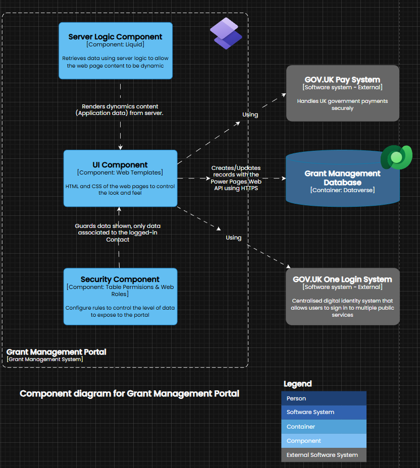
Component
Components are the building blocks that make the container.
For example, we have zoomed into Contoso's Grant Management portal to view the components within and how they interact. As this is a low-level diagram and the audience will be technical so the use of icons are introduced to reduce the cognitive load of the person viewing the diagram.
What's better ?
Granted I didn't spend as long creating the below reference architecture diagram however the clear winner for readability, are the diagrams created with the C4 model. The C4 diagrams are more clear and you have a range of views for different audiences. Another benefit with the C4 model is that you follow a strict format where it's encouraged to use ubiquitous terms across all diagrams rather than second guessing what icons represent. It's encouraged to use the terms that your customer uses and keep this consistent throughout the diagrams.
Reflection with resources
The C4 model is great and I will continue to use this as I keep learning. The main point to draw for any software architecture diagram is to create diagrams for the right audience. For instance, don't show technical icons to a non-technical audience as you will be wasting your time and the message you are trying to communicate through your diagram will be lost.
I'd encourage peer reviews of any software architecture diagram and to get a human or even AI to give a score out of 10 for readability.
Below are the resources I found to be useful to learn more about C4
https://c4model.com/introduction
https://cremich.cloud/create-meaningful-architecture-diagrams-using-the-c4-model
https://github.com/plantuml-stdlib/C4-PlantUML
The views and opinions expressed in this blog are my own and do not reflect the views or opinions of the company I work for.